PART 1: The Theory
The color wheel is built on the basis of three main colors: red, yellow, and blue. All other colors can be mixed from these colors.
By scientific belief, black is seen with the complete absence of color, and white is the presence of all color.
Because red, yellow, and blue are the root colors of all other colors, they are named the Primary Colors. Without any of these colors, none of the others would be possible.
Secondary Colors are colors created with the mix of only two of any combination of the Primary Colors. These colors would be green (yellow and blue), orange (red and yellow), and purple (blue and red). Here is an example image of what I mean:

As you can see from this diagram, the three big main colors are red, yellow, and blue; the three colors they create when mixed together are green, orange, and purple.
As colors go, some colors naturally look good together. There are many rules, guidelines, laws, or pointers to picking the right combination of colors to create an attractive image, but the main two are the Complementary Colors and the Analogous Colors.
Imagine there is a color-wheel that presents all the colors in a cycle from start to finish:
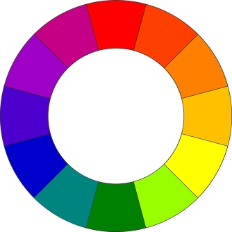
Here, the colors are all labeled according to what color they are (Y is yellow, YO is yellow-orange, YG is yellow-green etc.)
In the gap of this donut-shaped diagram, there are lines that reach from one color of the wheel, all the way to the other side; the colors opposite it. These are complementary colors. For example, yellow reaches out to violet, blue-green reaches out to red-orange, yellow-green reaches out to red-violet. These pairs are Complementary Colors.
Imagine the same wheel, but labeled differently:

Notice how the only colors labeled are yellow, yellow-orange, and orange. They sit next to each other on the color wheel. These are Analogous colors, and they look good for their similarities, whereas Complementary Colors look good for their differences. For example, orange, orange-red, and red are Analogous Colors, yellow-green, green, green-blue are also Analogous Colors.
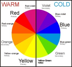
Moving away from pairing different colors together, let’s look at the moods they bring, either individually or collectively. Below is another diagram (because I just love pictorial presentations) depicting the color wheel divided into two, Warm Colors and Cold Colors. They are labeled like this because each color gives off a different mood, and red, yellow, and orange are all used by artists to represent warmth, like a fire, sunlight etc. And blue, purple, and green are all used to represent coolness, like ice, water, nighttime etc. It’s important to know which colors being out which general temperature, because creating an art piece about love or affection will probably want more warm colors than cool colors, and the vice versa goes with a portrait visualization of a monster or an antagonist.
Another cool thing about warm-cool colours is that they have different optical effects on the viewer. Warm colours tend to come out of the canvas and pop out, and cool colours tend to slink back and recede into the canvas.
Then, there are the Natural and Arbitrary Colors. This is fairly easy to explain; sadly I won’t have to use a diagram here. If you look at a forest, for example, you will see a variety of greens, browns, and maybe some other earthy colors, but since they are the colors as by nature intended, they are Natural Colors. Nature intends the sea to be blue-green, and rocks to be grey or brown, therefore they are all Natural Colors for the intended subject.
Now, Arbitrary Colors basically means unnatural. So, back to the forest, the trees would be pink, the ground would be yellow, the sea would be orange and the rocks would be rainbows. Yes. Completely unnatural.
PART 2: Examples
By these examples of Contemporary Art I will ensure that I actually understand this.

Morning on the Seine near Giverny, 1897
Claude Monet (French, 1840-1926)
Oil on canvas (81.6 x 93 cm)
The primary effect used in this painting is Warm and Cool Colors. The trees and water have a very cold tone of blue, which is the main color of the Cool Colors section of the Color Wheel. The effect of this is not necessarily expressing sadness or depression by the artist, but to me it feels like the artist is portraying a very chilling quietness in this landscape.

La Berceuse, 1889
Vincent van Gogh (Dutch, 1853-1926)
Oil on canvas (81.6 x 93 cm)
This uses Arbitrary Colors. The woman’s face is a bright and clear yellow, which is unnatural. It gives a feeling of a surreal atmosphere. It becomes less like a life portrait and more like an abstract representation of something personal to the artist.

Woman with a Hat, 1905
Henri Matisse (French, 1869-1954)
Oil on canvas (31 x 24cm)
Once again, Arbitrary Colors. Surrealism is in play, it makes it look like a dreamscape, like this woman is a part of the artist’s dreams, in admiration.

Relational Painting No. 64, 1953
Fritz Glarner (American, born Switzerland, 1899-1972)
Oil on canvas (50.8 x 50.8 cm)
The three big colors that I can see are the primary colors; red, yellow and blue. I can also see a tiny bit of orange. To me, the fact that the other parts of the painting is plain and monotonous and there are primary colors present, it seems like the theme here is something like ‘Potential’, the idea that these three colors can leak into each other and create endless possibilities of colors.
