
-
Recent Posts
Recent Comments
Archives
Categories
Meta
An Analysis of my own work – The Imaginary Bully

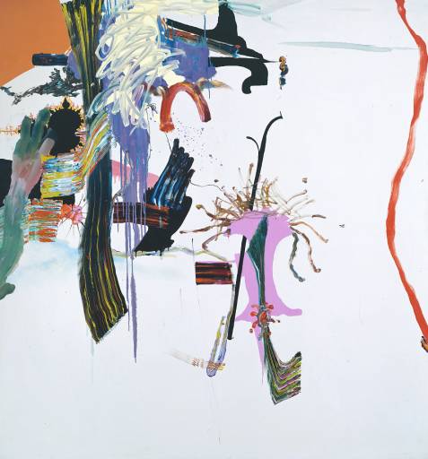
Enzie and Me – A4 size, digital media

Dream Catcher Enzie – A4 size, digital media
This is an analysis of my art works that have something in common; the one-and-a-half-horned fawn-demon 22-year-old woman-thing that follows me around and occasionally makes my life a living hell. Her name is none other than Enzie Adair. I will be looking into symbolism, such as Color Theory and the Yin Yang sign.
I know she’s not really real. I tend to label myself as a Cartoonist/Comic Writer. Detail and realism is the opposite of my forte. It just makes realizing what’s in my head a quicker and more efficient thing to do. Enzie to me, however, can be as real as looking in a mirror. So what do we see here?
I can see from my own work that I use a fair bit of Color Theory. A quick self analysis of these works can tell me that, from the piece on the left, I portray my colors to be red, while I portray Enzie’s colors to be yellowish. It’s all about color theory in my eyes. Red can symbolize caution, danger, anger, love, hate, and so much more that is bold and strong. It is the perfect color for myself, in my opinion, because I feel so much. All these interpretations and emotions that a color can contain, and the diversity of these emotions, describe me and my life quite well, with my intense mood swings and all.
So what does yellow mean? To me, yellow mainly means boredom. Such a bland color. Yeah it’s bright, yeah it can be interpreted to be gold (which would explain her superiority-complex), but in my opinion it’s not all that great a color. But that’s just me. So in short, I interpret Enzie to be bored. She’s bored of her existence, her appearance, and perhaps the fact that she cannot be seen by anyone other than me. And in comes the interesting part.
I almost always draw, paint, sketch, even sculpt her to look away from onlookers. Is she ashamed? Does she not care for her audience that sees her? Is she unaware that through art, others can see her too? Either way, she focuses on something that is not seen on the page. She is watching something carefully and cautiously, like a guardian of sorts, her weapon shown in her hand, whatever it may be. What does that mean? Does she protect me, despite she herself being a threat? It just means she is a danger, whether it is to me or to those who threaten me.

Another symbol that I like to use whenever I draw Enzie and I in the same frame is the Yin Yang symbol. Everyone knows it (or at least, I have been led to believe so), it is the ancient Chinese symbol of life and balance. Yin (the black) would represent femininity, passiveness, the moon and covertness. Whereas Yang (the white) would be the opposite and represent masculinity, activeness, the sun and openness. In some interpretations, Yin is good and Yang is evil, connoting to the tradition in Chinese theater that good characters would wear black or have black masks and evil characters would have white.
I’ve made this tie in with my art about myself and Enzie because of our relationship and how Ying and Yang suits our personalities so much. I am Yin because compared to Enzie I am good, I am the more feminine one in terms of style and behavior, and I am the more passive in terms of demands and expectations of Enzie. Enzie, on the other hand, is the opposite.
Notice how there is a small circle of Yin in Yang, and vice versa. Life is all about knowing that there is good in the bad, and bad in the good. It applies to nearly everything. Same with Enzie. She is horrible. Evil. Mean. Controlling. But I know that there is some good in her, just like how she tries to bring out the bad in me. Neither of us are perfect in good or bad. This is what makes us our own characters.
This is all very related to my previous research in Surrealism, where I am merely realizing the visuals of what I see in the back of my mind. Though I rarely see Enzie in my dreams, I strongly believe that she counts for a subconscious vision. There isn’t much Automatism involved (my style is usually precise and naturalistic) but at the same time this isn’t real. She isn’t real. At least, I figure it to be so.
Posted in Uncategorized
Leave a comment
Analysis – The Teachery of Images by Rene Magritte
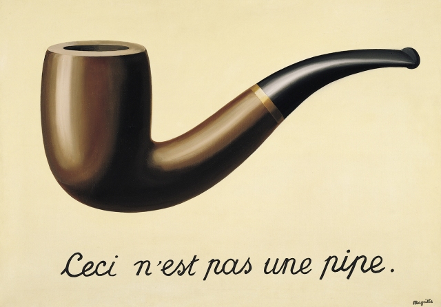
Ceci N’est Pas Une Pipe (The Treachery of Images), Rene Magritte, 1928-29, oil on canvas, 63.5 x 93.98 cm, Los Angeles County Museum of Art, Los Angeles, California, US
René Magritte was born in November 21st 1898, in Lessines, Belgium. He died in August 15th 1967, in Brussels, Belgium. Another artist who lived to see the beginning and end of the Surrealist movement.
Though Magritte was not as well known for his art as Salvador Dali, there was one painting that took a good hold of its audience, and that was The Treachery of Images.
Firstly, the subject of the painting was not as necessary as other paintings; where Dali’s The Persistence of Memories painting had lots of meaning behind each visual aspect, therefore the subject of the painting being highly important to the understanding of the meaning behind the painting, The Treachery of Images could be of anything. A pipe, a horse, a shoe. The subject of the pipe isn’t even in the title of the painting itself. What Magritte considered to be the key aspect of surrealist art was not what it looked like, but rather what it meant.
The French below the image of the pipe is translated into English as “This is not a pipe”. But many who first saw it criticized that it was indeed a pipe. It had the shape of a pipe, it had the natural colours of a pipe, and it is clear that Magritte put effort into finely painting it out so that people could easily recognize it as a pipe. So why does he also write that it is not?
Magritte is telling us that the pipe is not a pipe; he is making us realize and remember that we are not looking at an actual pipe, but just a good painting of one. By falling for the illusion of this visual misunderstanding, we are being deceived by artists who succeed in painting realism, hence the suiting title of the painting, The Treachery of Images. Because at the time, cameras were in use (as the first camera was invented in 1827[1]); Magritte and the Surrealists were trying to abolish the notion that paintings should be treated as photos when cameras could already produce life-like images more efficiently (albeit without colour at the time).
If not use art and painting for replicating and recording what surrounds us, what should we use it for then? Well, why not replicate and record what we cannot see, hear, or directly communicate with during the day? Why not imagine with paint, create something new with charcoal, or even alter the very fabric of our realities with marble, wood, clay?
[1] https://www.reference.com/history/first-camera-invented-422579aae26bb8a8#
Posted in Uncategorized
Leave a comment
The SONY Walkman
Released July 1979. Portable cassette player invented by Nobutoshi Kihara. Runs on batteries.
Kihara studied at Waseda University, Tokyo, Japan. He was involved in miniaturization, a field that would make Japan the leading electronics maker in the future..
It was the age where portability was in demand in the bustling city life, no one was bothering to carry a boombox around, and miniaturization fit very well into solving that.
Elsewhere in the world there were bigger and bulkier ways to playing cassettes such as VCRs, but they had to be plugged in and stationed in one place.
In this sense the Walkman was better because it was portable. That was its main selling point. It appealed to everyone who travelled often such as workers and students, who commute every day.
The Walkman was advertised very well in America, in fact it went very viral very fast there. It was all about innovation.
The 1970s lifestyle was the disco lifestyle, it was all about having fun, and music everywhere you go helped achieve the idea of enjoying every moment in your life.
The design of the Walkman was influential to future ideas and concepts of making information such as images, videos, and documents, portable and easy to keep on your person. They even produced a portable CD player not too long after the CD player station was released. In 2007 they engineered their first phone which was able to playback audio and video on their phones as well as take and make calls.
sources:
http://content.time.com/time/nation/article/0,8599,1907884,00.html
http://www.theverge.com/2014/7/1/5861062/sony-walkman-at-35
https://www.sony.net/SonyInfo/CorporateInfo/History/sonyhistory-e.html
Posted in Uncategorized
Leave a comment
Bauhaus
Contextual Studies:
Today’s notes:
The Bauhaus: The machines, the lines, the new
History:
Late 19th century – Victorian Architecture and Interior Design
Russian Revolution – 1917
Take over victorian-style houses and sweeping away the old styles, wanting the new
WW1 1914-1918: The Defeat of Germany
Beginning of the End of Aristocracy
Modern Art had already responded to this with Abstraction
New subject matter, from scenery to people and machines
Russian Suprematism
stripped of all previous artistic components, highly radical, search for purity and the sublime, the idea that straight lines were better than curves
Mondrian and De Stijl (Artists that moved from their old style to Abstraction)
Furniture changed from carved puffy Victorian armchairs that cannot be mass produced to sleek rectangular chairs that can be manufactured (but lacks the human element(not comfy!))
Bauhaus is an art school in Dessau, Germany, believing in Utopia and remaking the world through art (applying fine art ideas into design)
Blur the line between art and craft
Making the world a better place for common people
The Aesthetic side of the Machine Age
Not just cheap and easy, but it is also beautiful
The design of the Bauhaus building took the rising and setting of the sun into consideration to fully optimize it’s function and use
No excess components in design, geometric and interlocking shapes, mechanical themes, industrial materials
Downsides to the Bauhaus:
They restricted student’s creative thinking process (at most primary colors, no curves or circles, must be really simplistic etc)
The Bauhaus building was not equipped to take care of human comfort (too hot during the summer, too cold during the winter etc)
Bauhaus Legacy:
Various modern designs based off the rectangular shapes and geometry that Bauhaus thrived for
Nowadays architects and designers take the characteristics of Bauhaus (Aiming for simplicity, aesthetics mixed with the easily manufactured, function first over elegant beauty) and try to push it further
Some architects like Zaha Hadid worked away from it
Posted in Uncategorized
Leave a comment
Kazimir Malevich and Supremastism
Today in class we discussed the concept of Abstraction and its influence on art throughout history. An artist that commonly came up in this discussion was Kazimir Malevich and his constant search, through art, for a Sublime Higher Power.
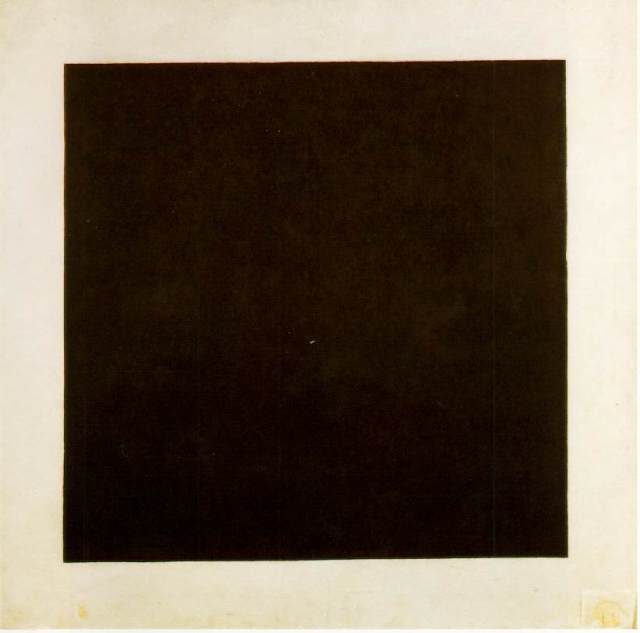
Black Square, 1915, oil on linen, 79.5 x 79.5 cm, Tretyakov Gallery,Moscow
This was one of Malevich’s most popular pieces of art, the Black Square. He himself described this as ‘The End of The Beginning’, and others saw it as a method to completely strip visual art of its components until nothing but the pure essence was left. This, he thought, was the way to be closer to the Higher Power of the universe, or as many people name it, God. It was very radical, so radical that the only way to be more radical was to not paint on the linen at all.
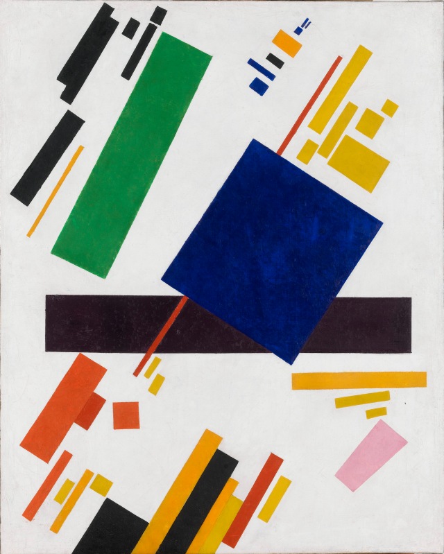
Suprematist Composition, 1916
Malevich then experimented, or rather, explored the idea of creating depth and space on a flat canvas. No form, no tone, no shade, only strips of very basic colors that seem to be in front and behind of each other. This may be the starting source of the now-known Color Theory that certain colors have different “Z-axis”positions on a flat surface depending on its…well…color. It’s an illusion that contemporary artists now sometimes use, but I doubt that was Malevich’s intention, considering his ultimate goal was to reveal the truth of the Hidden Sublime.

White Suprematist Cross, 1927
Later in his life he moved onto his Elite White Period, where his works were so abstract that it was devoid of any need of color. This could be considered as the purest of pure essences of art and reaching that Higher Power or God.
Posted in Uncategorized
Leave a comment
Abstraction: What is it all about?
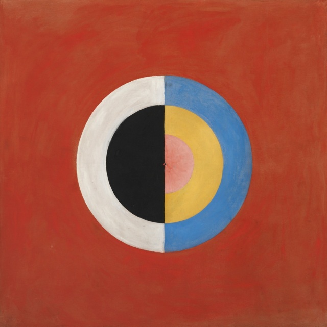 Svanen (The Swan), No. 17, Group IX, Series SUW, October 1914-March 1915
Hilma af Klint was considered to be one of the first artists to associate with Abstraction. This piece is not representational or realistic; it is purely color.
Abstraction is the style of art where you think instead of see. In most abstract art there are no recognizable imagery or forms or sequences of color. It tugs at what your mind thinks it sees. It’s a psychological play-time, where the artist creates with automatic gesture and rhythm, and the viewer probably interprets something else from it. To me it seems like a broken line of communication from artist to audience.
The main characteristics of abstract art is that it’s flat against the canvas; no implications of 3D or anything real at all.
The way of abstract art was sort of split into two directions; geometric an non-geometric. Af Klint is an example of geometric abstract art.
 Untitled (yellow) (1990)
Fiona Rae is a more recent artist, but also goes for abstract art. Her work is a fine example of non-geometric abstract art. It is more rhythmic and gestural than Hilma af Klint’s.
Posted in Uncategorized
Leave a comment
Pop Art Lesson: Exercises
Part One:
Barbara Kruger: I Shop Therefore I Am
 Untitled (I shop therefore I am) by Barbara Kruger, 1987
111″ x 113″
photographic silkscreen/vinyl
What well-known publication has Barbara Kruger imitated to make this image?
This looks like Time Magazine, with the color scheme of black, white, and red with white text in the red box. As well as the typeface.
What text has she appropriated?
Kruger is referring to the famous quote by French Philosopher René Descartes.
“Cogito ergo sum.” which means “I think, therefore I am.”
What technique has she used to create the image, and why is it appropriate?
Barbara Kruger used silkscreen printing as her technique. It’s appropriate to this time because of how commercial the technique is in terms of its main use as well as how the times were all about mass-production, and again, silkscreen is the appropriate media to quickly replicate one image over and over.
How could this be a satirical image?
I guess this could be satirical in the sense that she’s taken a famous philosophical quote and changed it into what seems like an advertising slogan for a shopping mall or something. It’s like she’s mocking the higher class of society and taking something so posh-y and high class and turning it into this thing that everyone can use. It no longer belongs to the higher class and it may anger people like that.
Part Two:
Andy Warhol: Marilyn Diptych
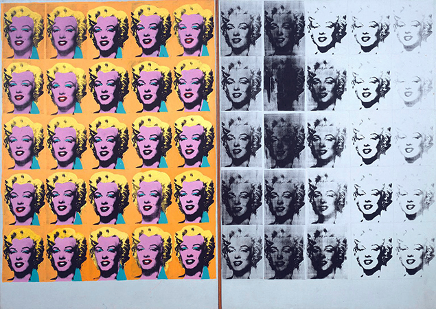
Andy Warhol, Marilyn Diptych, 1962
acrylic on canvas, 2054 x 1448 mm
(Tate) © The Andy Warhol Foundation for the Visual Arts, Inc. 2015
What is the effect of the repetition of the image?
To me it’s like you see the celebrity everywhere. Because Marilyn Monroe is so famous her image is used on billboards and advertising, because men aspire to be with her and women aspire to be her. That’s what I see on the left. On the right I see something like practice prints, imperfect results of printing; they remind me that it’s not really Marilyn, it’s just her image repeated. The arbitrary colors also tell me this.
What materials and techniques have been used, and what is the effect of these choices?
Perhaps silkscreen again, but with acrylic paint to print with. Maybe a stencil. Acrylic, compared to oil paint, is considered lifeless and flat. This effect could be used perfectly for mass-production, where the print can be re-used and handled easily as the acrylic paint dries faster than oil.
How could this be an ironic image?
This can be ironic in the sense that Marilyn Monroe is a unique person, a star among stars, there can only be one of her and one like her and it is her. But here on this canvas we see lots of Monroes all looking the same, as though she wasn’t unique, as though she wasn’t a star.
Posted in Uncategorized
Leave a comment
Surrealism Essay Draft
Can Art Help Us Fully Comprehend Our Subconscious?
Posted in Uncategorized
Leave a comment
M+ Gallery and Art Central Trip
Fairly recently I went on a trip to two artistic venues during Hong Kong’s Creativity Week. These venues were only there for a limited time but my group and I managed to see both. We also planned to visit Art Basel, but unfortunately we could not get in due to long lines and high prices.


Before visiting the first venue, Art Central, we went around the city area close by, looking for Antony Gormley ‘s freshest installment right here in Hong Kong: the Event Horizon project. This project consisted of many metal statues molded to Gormley’s physical figure and placed around the city, on ground or high above ground.
Personally I counted 13 statues (I’m confident there were more that we didn’t spot), and the ones above ground were not just placed on the roof of buildings, but at the very edge, so that 1) they would be easier to spot from lower down, and 2) the statues can be personified to enjoy the view of looking down from above.
Another cool thing to mention is that every statue faces, or looks at, the direction where another statue can be found. You only need to look really hard.
People have reported to the authorities that they’ve seen the statues as jumpers. But to the eyes of an artist this only proved that the project was getting the people’s attention, that this work is being seen.

“Beyond the Canvas” by Jane Lee, 2016, mixed media on canvas, wood stretcher and fiberglass, 125x110x23cm

“Crayons Installation” by Fridericks Katrin, acrylic on canvas, 20x180x10cm

“Suspended Lanscapes” by Thomas Canto, 2016, 3D installation
Then we went to the incredibly large hired space where the AIA carnival was held not too long ago, in Central. This space was now fully occupied by two giant white tents. Not very artistic or colorful on the outside, and once we got our tickets and went in the atmosphere was similar. The outside of the tent said simplicity and humility; it doesn’t cry for attention (I almost walked right past the door without noticing it at all) and it kind of does the same thing inside, where the walls were plain white and the floor a grey carpet, again not calling for attention. This is a good thing I guess, because if the walls and floor was colorful and full of life it would be difficult to pay attention to the art hanging on the walls. The simplicity and dulled down tones makes all the artworks stand out. And just like outside, it was quiet. It felt really posh. People in suits and discussing art in such a manner that I felt like a savage neanderthal, just wandering around the place and not really understanding art the way they do.

“Calligraphy Peach Blossom Garden” by YangJiang Group, 2004, calligraphy papers, plastic trees, wax, wooden bridge, CCTV and message machine

“New Beijing” by Wang Xingwei, 2001, oil on canvas

“To Add One Meter to an Anonymous Mountain” by Zhang Huan, 1995, chromogenic color print
Our second venue was the M+ Gallery Sigg Collection of Four Decades of Chinese Contemporary Art in ArtisTree in Taikoo. The atmosphere was a little less posh, but still relatively quiet apart from the video installation. It was a much smaller gallery than Art Central, and there were less works, but here there was more of a unified theme between works of art than Art Central. M+ Sigg Collection had the theme of Chinese Contemporary Art, whereas Art Central seemed to have everything.
In both galleries there was an intense variety of art styles and forms and medias. It taught me that the possibilities really are endless when it comes to making art; it can be really simple and easy to do, or it can be complex and take weeks to complete/perfect. But it will all be appreciated. But it also makes me think of how many times these artists have been rejected by galleries before they were accepted. Being an artist is difficult in this world simply because of how one portrays a message. If it’s too confusing or difficult to figure out the artist’s message then it is more likely to be rejected. It’s also very opinionated and it depends on whether the curator of gallery manager likes your work. If not, it doesn’t go in, and the artist has to try again somewhere else.
From this experience I guess I learned a lot. You can do whatever you want, but you also need to focus. What is your message? What is your point? How are you gonna show that in a way that others understand? It is these questions that probably run through every artist in this century.
Posted in Uncategorized
Leave a comment
